Thursday, June 20, 2013

Our Wedding Invitations


For me, wedding invitations are a great part of a wedding: is the one thing you can work on way before your wedding day and when you send the invitations out, it's a sign that "this is really happening". 

I've seen it in many brides: that look when opening a wedding invitation and realizing that it's yours and your husbands to be names that are written there: wow! It really is magical.... From that moment on, you start feeling and experiencing a taste of what the big day is all going to be about.

I've been designing wedding invitations for many couples that have got married in the last few years but the invitation I am sharing with you today is a special one: this is our wedding invite!


I must admit, one of the things that I was most excited about the whole wedding preparation, was the idea of designing our very own wedding invitations. I've spent quite some time helping other people getting beautiful invites for their weddings and I always wondered how ours was going to look like. You might think that it was an easy job, but not at all; I think that it was the most difficult design I've ever worked on because there are so many things I like and playing the role of  both bride/client and designer, wasn't easy, hehe.

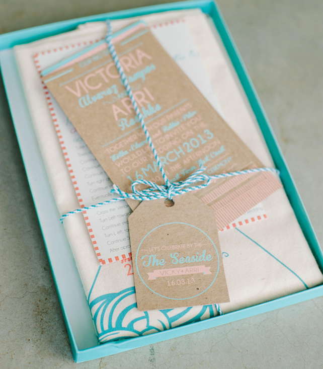
We wanted to do something special for our invites, and even though I love keeping wedding invitations in my "keepers box" where I collect all sort of beautiful papers, I'm aware that most of the people throw away the wedding invites after a while. That's why I wanted to do something that our guests could use and something so precious that if the smallest idea of throwing it away crossed their minds, they would feel really guilty, heheh.

Our wedding invitation consisted in a box with a few goodies inside:  3 cards screen printed in 2 colors on craft paper, a little tag and map to the venue and a tote bag to carry around everywhere! Of course, there was an English and a Spanish version for our guests. 
The colors we used where sea turquoise and bright coral combined with white. The theme was "Take me to the Seaside" and the mood was happy and energy-sizing with a friendly and approachable tone. Of course we played with fonts and incorporated some fun illustrations and nautical icons.

I hope you like it as much as I do!

Thank you Maree from Natural Light Photography for helping me with the photos for the post.

Tuesday, June 18, 2013

Our Wedding | Save the date


Vicky & Arri {Save the date | Reserva la fecha} from Vicky & Arri on Vimeo.

A few days ago, the South African wedding blog, South Bond Bride, made a beautiful feature on our wedding day, so I thought it was about time for me to share with you everything that leaded to my most favorite day ever...
You might have read how I asked my bridesmaids here and a little life story post  I made here but here a bit more: our save the date!

Normally in a save the date all you need to say is "Save the date for our wedding on...." but we wanted to say a little bit more than that; we wanted to share once again, the story of how we met and get everyone excited to come to our wedding: specially my family and friends in Argentina. I wonder if we had just sent out a simple email saying "we are getting married, save the date for our wedding 16 March 2013" it would have had the same impact. I like to think that not, and that thanks to the effort we put into creating the save the date, many of my friends thought about coming a lot more seriously, hehe.

We sent out an email to all our friends and family that linked to a video we made together with my husband -(I'm very lucky as Arri does 3D animation and knows a lot about shooting and editing). Besides the little introductory video, we included some information and details for accommodation for the wedding weekend and of course an online RSVP system. For the family and friends overseas, we also included a pdf presentation with more details on Cape Town in general so they could start planning, what we like calling, a holiday-wedding combo! I hope you like...

Wednesday, June 5, 2013

Calentita 2013 - Mocho Loco International Work


Most of the work I do is mainly for South Africa or commissioned for Argentina, but once in a while I get to work on some projects for other parts of the world. So when the guys from Calentita contacted me all the way from Gibraltar, I couldn't hide my excitement. Specially when they said that they wanted me to design and illustrate a poster for the biggest street party and food festival in the area.

Gibraltar is a curious place: it sits on the southern most tip of Europe - the gateway to Africa and is the meeting place between the Mediterranean and Atlantic. Geographically tiny, (5k long 1.5k wide) it is home to 30,000 people. British for more than 300 years but it was previously spanish, then moorish then spanish, then moorish... the site of many sieges, a natural safe harbour, trading post and refuge and it has been culturally diverse and cosmopolitan for many years - home to spaniards, british, italian, portuguese, moroccan, jewish, and over the course of 300 years its own population of Gibraltarians (or llanitos - pronounced yanitos) and its own peculiar mix of english and spanish (llanito). 

Calentita is the "national dish" of Gibraltar and Calentita, the food festival, celebrates all of the above - both historic culture and food influences. 2013 is the 7th edition of this festival...


For the Festival poster, the organizers wanted to reflect a fairly common scene in Gibraltar which is the trip to the beach. So before getting head down to work, I did quite an intensive search on the customs of the place... There are a few things that instantly resonate with the local population about a day out at the beach in Gibraltar: firstly they are ramp packed right to the waterline, everyone sits under an umbrella which will be branded (reminded me of Mar del Plata's summers in Argentina), people like to drink hot tea and eat rolls; they play a game called "tablita" which is basically ludo but with much more interesting looking hand made boards. And as one of the festival organizers says, "we're a bit backward in Gib and the speedo trunk is far from unknown as is the well tanned gentleman sporting them"....  heheh


So if by any chance you are in Gibraltar at this time of the year, don't forget to check out Calentita (not that you could miss it if you are there)... Hopefully, I'll be able to go and experience it myself in future years...
If you want to find out more about Calentita click here

Tuesday, June 4, 2013

Week#8: My Photography Project - Offices and Spaces


For the last few weeks I've been freelancing for 24.com, one of the biggest digital media companies in South Africa. 
It's been a while since I last worked in a proper corporate environment but I must say, I really enjoyed it! Perhaps because I knew I was going to be there only for a few weeks or because the work itself was pretty cool together with a super fun team of great people...

I got to work on some of their bigger brands such as Careers24 and Fin24 but what I enjoyed the most, was working on some side projects they assigned me... I'm not really allow to say much more than that, as they haven't gone live yet, but as soon as they do, I will share with you.

They were pretty cool in letting me take pics of the offices for my weekly Photography Project entry. As you can see the offices are pretty modern and spacious.... And as many media companies, they have awesome kitchens and recreational areas- which I love... plus a CEO that brings fresh cupcakes for their staff every Friday- pretty rad, don't you think?

Thanks Nadia, Marc, Geoff, Deirdre, Catherine, Ricardo, Hanna, Terina and the rest of the team for making me feel so welcomed and at home! Looking forward to working with you again in the near future...

Saturday, June 1, 2013

Gina and Wentzel's Italian Vineyard Inspired Invites

Gina and Wentzel got married in March this year and had a beautiful Italian Country Inspired Wedding.
For their invitations they asked for something clean and elegant but at the same time, natural and with a rustic feel to it. And even though they might seem as opposites (elegant and rustic), we managed to achieve this interesting mix of contrasts!

The colors we used were wine dark red, wood styled brown and white. The combination of a delicate pattern, textured paper and the cursive elegant typeface, gave this suite the perfect warm feeling the couple was looking for.

The names printed on the front of the envelope, that then would unfold to present the formal invitation and a black and white polaroid styled picture of the bridal couple, just finished off this invitation.

I hope you also like! Wishing you a Happy Weekend!